
Redesign Albert
- Evaine Sun
- May 11, 2023
- 4 min read

Updated: Aug 30, 2025
A redesigned version of Albert, the NYU web-accessible registration system.
Introduction
Albert is New York University’s online student information system, where NYU students, faculty/advisor, administrator, alumni, etc. can register courses, download schedules, manage transcripts, make payments etc.
Among all the features Albert has, course registration is one of the most used, where all the students search and enroll courses every semester. However, students have found it difficult to access because some subpages hover around and are not optimized for different screen sizes, the search function and the filters are not intuitive, does not have convenient schedule function or course evaluation function, etc.
Therefore, I redesigned the website version of Albert by rearranging the layout and reorganizing the information, with an emphasis on the course registration process.


Empathize


User Interview
Sample questions:
How often do you use Albert?
What do you mainly use Albert for?
What platform do you use Albert on? Laptops/tablets/mobile phones?
On a scale of 1-5 (5 very familiar), how are you familiar with all the features in Albert?
On a scale of 1-5 (5 very easy), is it easy for you to see the contents displayed in Albert?
On a scale of 1-5 (5 very satisfied), how will you rate your experience using Albert?
What is your best/worst experience using Albert?
Sample answers:
When I go to shopping cart, the subpage is not in the middle of the screen, and the page will be stuck when use iPad.
When I adjust tab size, information often run out of my screen.
I often use Albert to select courses, check classroom locations, pay tuitions, and check instructor evaluations.
When I want to go back to the main course search page, it closes the entire subpage and sends me to Albert mainpage.
The filters could be classified.
I have never used the calendar in Albert because it is so difficult to use. I always use Google Calendar.
After I’m done selecting a class from one school, and I want to switch to another school, I would like Albert automatically clear it out instead of me clicking on “return to browse by subject”.
I wish for each professor/course you want to select, Albert would allow a pop-up to see evaluations of the professor/course, so I do not have to switch between two different windows.
Summarized pain points:
Search function not very intelligent.
Shopping cart page hovering around.
Filters can be better.
If close shopping cart page, goes back to main page.
Banners doesn’t make sense.
Bad calendar.
Class search doesn’t display evaluations.
Define
Albert is for education. The market consists of 60,000 NYU students, over 5,000 NYU faculty, and numerous visiting users.
While the original Albert has been functional, I would like to make it more reliable, convenient, and even meaningful.
Positioning Statement
For NYU students who need to search and register for courses. The redesigned Albert is a website that can easily find courses they want to take, unlike the original Albert, our product has clearer filters, course information, and registering logic.
User Personas


Ideate


Prototype


Test
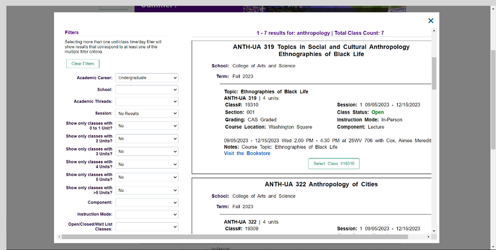
Original Albert:
Search and filters better
Search result page (a subpage) hovering around, exit route unintuitive
Calendars better
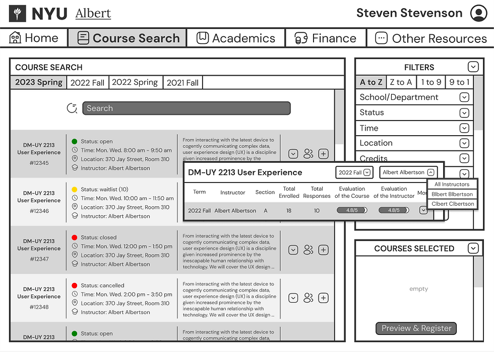
Redesign Albert (midterm version):
Information too dense, lines too dense
Some features unnecessary and unintuitive
Filters under search
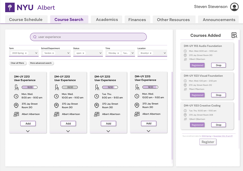
Redeisgn Albert (final version):
More colors, all centered or shift-left
Scrolling bars thinner, borders thinner, rounded corners
Liked the schedule function, doesn’t have to make a spreadsheet myself
Before vs After
For the Couse Seach (homepage) page, I eliminated the banner on the homepage and replaced it with a course schedule. I also made the menu horizontal instead of vertical so that it can always hover on top of a page.


For the Course Search page, I made it a separate subpage instead of letting it hovering around. I improved the filters and placed them under the search bar.


For the Course Search Result page, I reorganized the course information, added icons (the icons are clickable and lead to calendar/map/evaluation), and placed each course vertically to make them more intuitive and more comparable. I also put the added courses right next to the searching results so that users can easily recall what courses they added already.
Final Work


Future development:
make versions of tablets and phones
solve the technical aspects: not crashing when a lot of people are registering courses, etc.